MAP: 2012 Was the Hottest Year on Record in the US

Fight disinformation: Sign up for the free Mother Jones Daily newsletter and follow the news that matters.


Just saying.

This NOAA map shows a sampling of places where weather records were broken last year. You probably guessed that red indicates heat. Yellow represents dryness; orange is a double whammy record for heat and dryness.

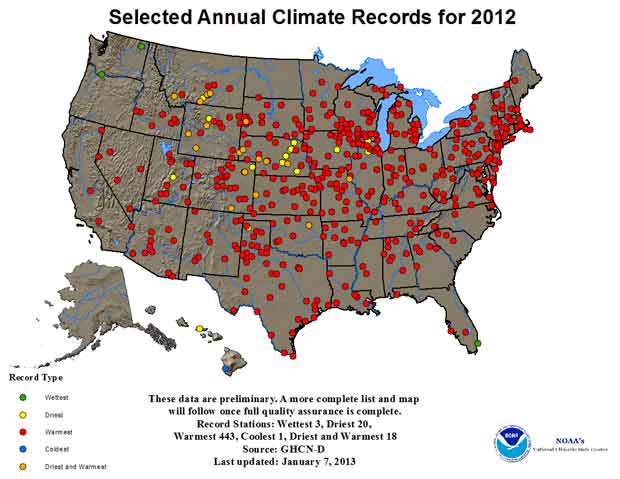
Image courtesy of NOAA

Fact:

Mother Jones was founded as a nonprofit in 1976 because we knew corporations and billionaires wouldn't fund the type of hard-hitting journalism we set out to do.

Today, reader support makes up about two-thirds of our budget, allows us to dig deep on stories that matter, and lets us keep our reporting free for everyone. If you value what you get from Mother Jones, please join us with a tax-deductible donation today so we can keep on doing the type of journalism 2024 demands.

payment methods

Fact:

Today, reader support makes up about two-thirds of our budget, allows us to dig deep on stories that matter, and lets us keep our reporting free for everyone. If you value what you get from Mother Jones, please join us with a tax-deductible donation today so we can keep on doing the type of journalism 2024 demands.

payment methods

We Recommend

Latest

Sign up for our free newsletter

Subscribe to the Mother Jones Daily to have our top stories delivered directly to your inbox.

Get our award-winning magazine

Save big on a full year of investigations, ideas, and insights.

Subscribe

Support our journalism

Help Mother Jones' reporters dig deep with a tax-deductible donation.

Donate