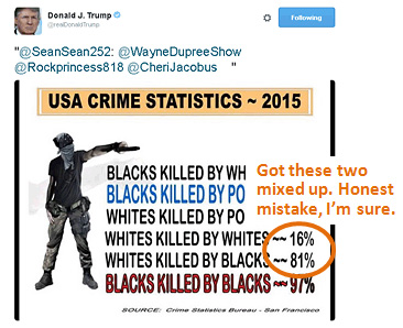
 Having already played the hate card against Mexicans and Muslims—and getting crackerjack results—Donald Trump has apparently decided to move on to African Americans. I don’t know what the “Crime Statistics Bureau” in San Francisco is, and I don’t think I want to know, but one of the most well-established facts about murder in the United States is that it’s pretty racially segregated. Whites kill whites, blacks kill blacks, etc. But today Trump decided to tweet the CSB graphic on the right, for no readily apparent reason. And wouldn’t you know it: it contains a wee racial error. It claims that most whites are killed by blacks, but in 2014, which is the latest full-year homicide data available from the FBI, 82 percent of whites were killed by other whites and only 15 percent were killed by blacks.
Trump’s tweeted graphic swaps the numbers for the offender’s race—but only for white victims. For black victims, the numbers in the graphic are roughly correct. This makes it look like blacks kill everyone. And just in case these numbers are too subtle for you, it includes a stereotypical black thug to make sure you get the picture. Donald Trump has found his audience, and he knows what they want. So he’s giving it to them.
UPDATE: Come on, folks. This graphic is not “controversial” and it’s not “questionable.” It’s wrong. Period. The numbers for white victims are swapped in a grossly obvious way intended to make a racist point. FFS.


