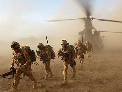
<a href="http://www.flickr.com/photos/defenceimages/5114272865/sizes/m/">Defence Images</a>/Flickr
On Sunday, it was widely reported that the number of US service members killed in the 11-year war in Afghanistan had reached 2,000. The latest fatality was an American soldier killed over the weekend in the eastern part of the country, according to the Associated Press. But that statistic hardly gives a complete picture of American losses in Afghanistan.
CHART: US Military Deaths in Afghanistan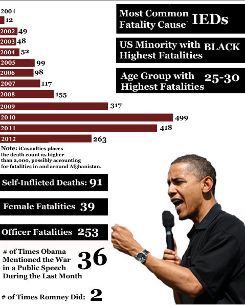
Source: iCasualties, Defense Casualty Analysis System
 iCasualtiesThe two sources used in the infographic estimate that the death toll is actually significantly higher. According to iCasualties, an independent group, there have been 2,127 US coalition military deaths from 2001 to October 2, 2012. And according to the Defense Casualty Analysis System (which is where the demographic breakdown comes from) the toll stands at 2,118. These numbers may be higher due to deaths that occurred outside of Afghanistan but were caused by wounds in theater, or indirect deaths that were still related to the mission (for example, suicides.)
The number 2,000 doesn’t tell you that an increasing number of these deaths are occurring from improvised explosive devices (IEDs), which caused more than half of US fatalities in Afghanistan in 2011. It doesn’t reveal anything about the prevalence of “green on blue” attacks, in which rogue Afghan Security Forces kill US soldiers (see the map below). It doesn’t say anything about how President Obama and GOP presidential candidate Mitt Romney plan to deal with the logistical aftermath of the war. And it definitely doesn’t measure the hurt of families who have lost loved ones.
 New America FoundationThis great resource was created by the New America Foundation with the National Security Studies Program. To get the full interactive version of the map, click here.
Image of President Obama courtesy of Flickr User JM Sloan.
Image of Afghanistan soldiers courtesy of Flickr User Defence Images.
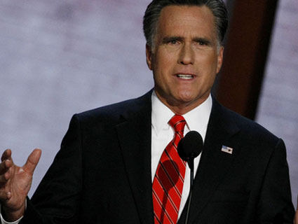
Note: The infographic’s speech numbers were calculated by looking at Romney’s public speeches and Obama’s campaign remarks made public by the White House over the last month. The tally does not include the president’s “weekly address,” and only counts one mention per speech, even if multiple mentions were made. Because Romney may have mentioned the war in additional campaign speeches not publicized by the media, the numbers should be considered a minimum. Regardless, Romney has been criticized for repeatedly failing to mention the war, even in his Republican National Convention speech.