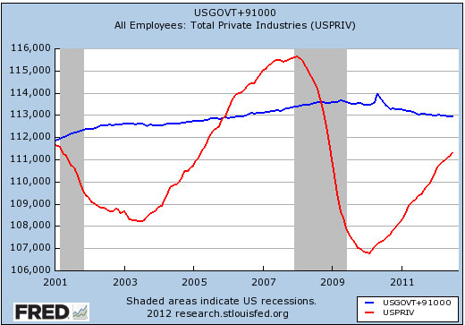
Adapted from Matt Yglesias, here’s a chart showing the growth of private employment (red line) and state/local/federal government employment (blue line) during the past two administrations. The government employment line has been shifted up so it starts at the same point as the private employment line.
Under Bush, government employment increased by 1.7 million and private employment decreased by 0.6 million. Under Obama so far, government employment has decreased by 0.6 million and private employment has increased by 0.3 million. Just thought you’d like to know.


