
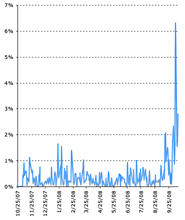
CHART OF THE DAY….A couple of weeks ago I quit watching the stock market’s gyrations during the day because it was obvious that they didn’t really mean anything. Up, down, whatever: the events of the final hour, from 3 pm to 4 pm were all that mattered, wiping out huge gains in an instant or turning small losses into disasters.
Now comes a nice chart via Zubin Jelveh that demonstrates the point graphically. As you can see, normally the stock market moves anywhere from a quarter of a percent to one percent in the final hour of the day. That’s roughly the same as the other six hours the market is open. But since mid-September? Final-hour volatility jumped to 2%, and then earlier this month to a high of 6%. That’s as much movement as the entire rest of the day. So if you’re the nervous sort, give yourself a break and take your eyes off the hourly movements of the Dow. Just check in at 4 pm and be done with it.
Need some more charts? Ezra Klein has a nice one showing that sometimes placebos work just as well as surgery. (With a followup here.) Maybe those Christian Scientists are on to something after all?