The Project on Defense Alternatives sent me this email a few minutes ago:
We’ve just opened the web page Trillions to Burn? A Quick Guide to the Pentagon Budget Surge — please have a look. It’s a quick read with 9 charts that explain why the DoD budget has risen to over 700 billion and what it implies for other federal spending and the national debt.
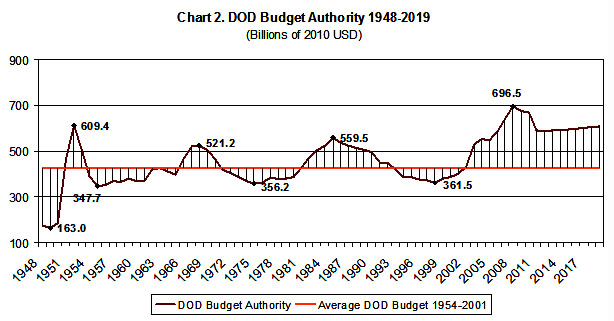
Hey, you had me at “charts”! So here’s your chart of the day: a look at Pentagon spending since World War II, adjusted for inflation. Right now we’re spending more than we did during the Korean War, the Vietnam War, or the Reagan military buildup. And there’s no end in sight. More at the link.


