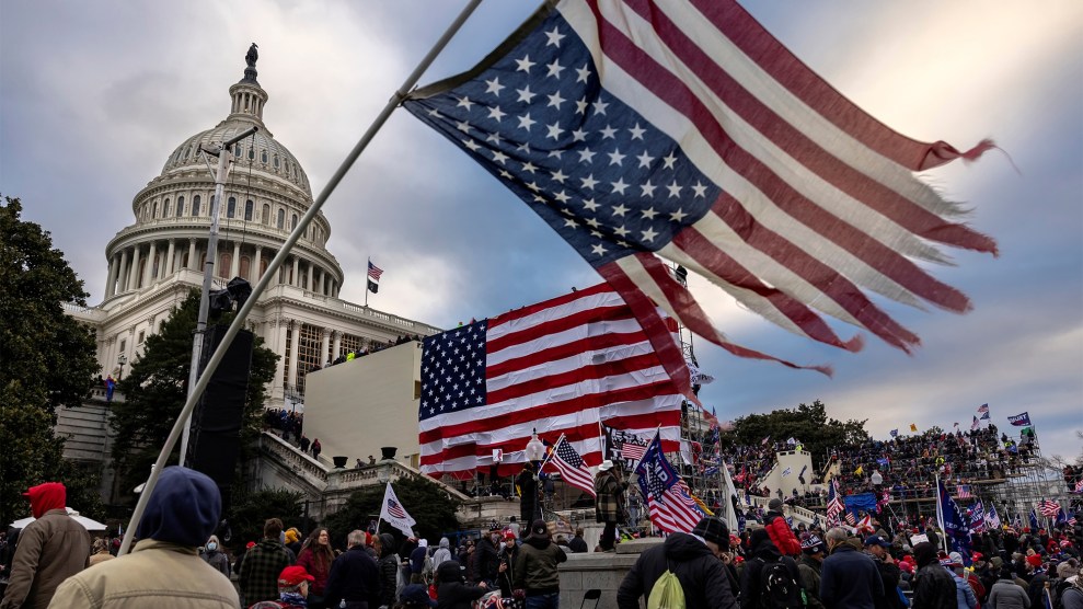

After this morning’s leak of the CDC projection of COVID-19 deaths, the White House pushed back and said it would continue to use its own internal modeling:
A senior White House official said the document would not change the White House planning on reopening. White House officials have been relying on other models to make decisions on reopening, including the IHME model and a “cubic model” prepared by Trump adviser and economist Kevin Hassett and the Council of Economic Advisers.
This has prompted a considerable amount of chuckling in my Twitter feed. First, though, here’s what a cubic function looks like:
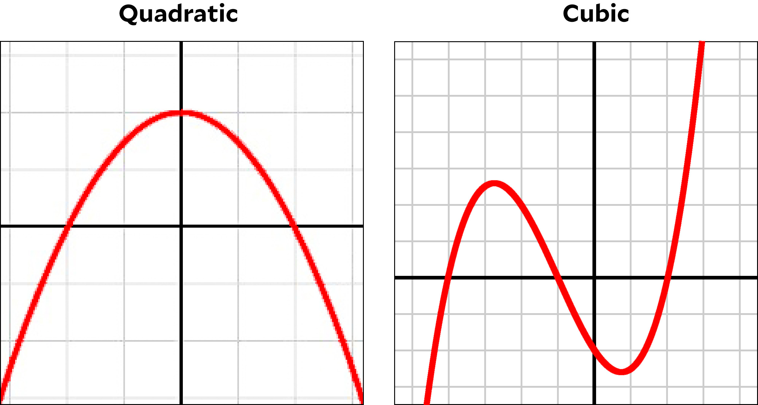
Roughly speaking, a quadratic function, familiar from high school geometry, always goes up and then down (or down and then up). That’s it. A cubic usually goes up down up (or down up down). They are both fine polynomials, but when it comes to trendlines there aren’t many circumstances that call for using a cubic function to fit a bunch of dots in a chart. However, there are occasional reasons. For example, here’s the daily death toll from CV19 up through May 3, fitted with a cubic curve:
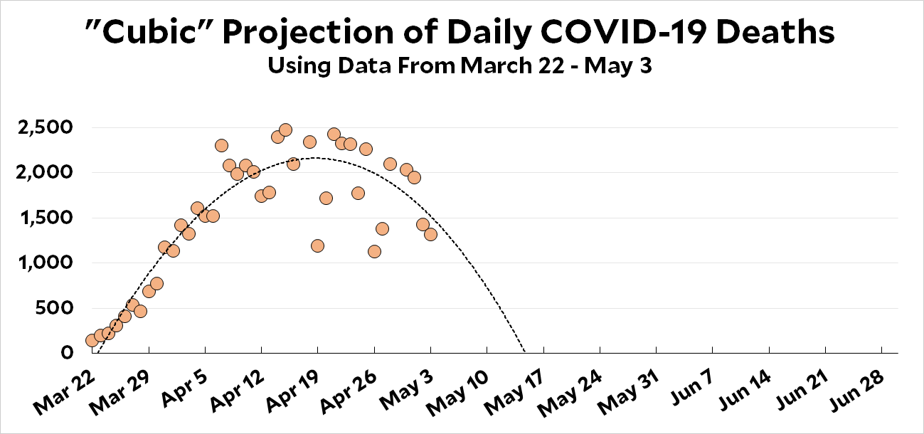
What’s the point of using a cubic to fit this curve? It doesn’t even go up down up! Well, a cubic fit gives you an extra parameter to play with, which means it’s easier to generate a result you like. In this case, it projects that deaths will drop to zero in about two weeks. This is neither particularly honest nor particularly likely, but I imagine the White House likes it.
Another reason to use a cubic fit is if you have a credible underlying model that suggests you should use it. For example, if you see that states are opening up and people aren’t taking social distancing seriously enough, your model might tell you that the downward trend is bound to turn back up. This calls for a curve that goes up, then down, then up again. A cubic. In the chart below, I’ve added a month’s worth of projected data and then overlaid it with a cubic trendline:
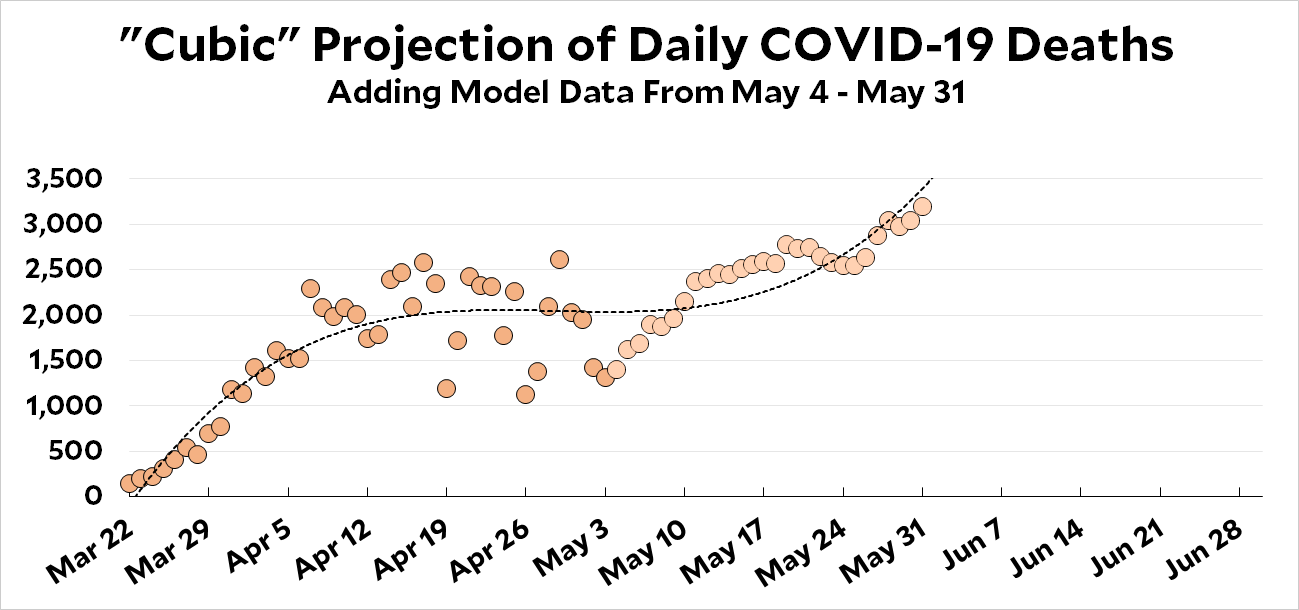
Now, these are both made-up curves (though the data points are real) and are meant as illustrations only. But they show how easy it is to produce the results you want if you’re willing to torture the data a bit. It turns out, for example, that these trend curves are very sensitive to the starting date. So by choosing the starting date carefully and then fitting a cubic curve, you have a lot of leeway to produce what you want.
Anyway, the irony here is that thanks to President Trump’s campaign to reopen the country, it’s entirely likely that a cubic actually is the best fit of the data. Just not the particular cubic that Hassett and his pals are probably using.