Evan Vucci/AP
These days, perhaps the most hotly debated issue in climate change circles has little to do with science. Rather, it is over how to communicate that science to a public that still does not get it.
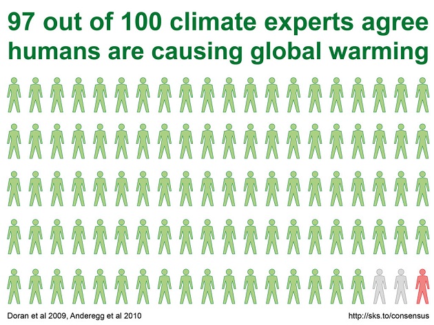
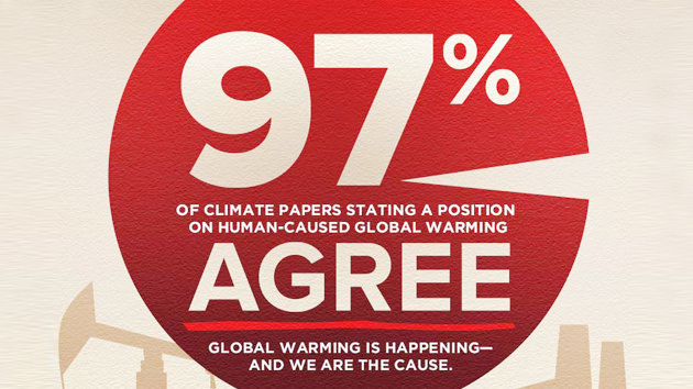
The leading communication strategy at present is built on a now famous 2013 paper—whose main result was tweeted out by no less than President Obama—finding that 97 percent of scientific papers (those that took a stand on the matter, anyway) supported the scientific consensus that humans are causing climate change. This result is often simplified down to the idea that “97 percent of scientists accept the consensus that humans are causing global warming.” Spreading this simple message, say supporters, is a critical way to get people past the wrongheaded idea that climate science is still subject to “debate.”
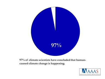
The strategy has its critics, including Yale science communication researcher Dan Kahan, who contends that the approach will backfire among conservative ideologues. A new study just out in the journal Climatic Change, however, suggests not only that the “97 percent consensus” message can be effective, but that it will work best when expressed in the form of a simple phrase or (eat your heart out, USA Today) a pie chart. Like this one, which is an actual image designed to spread the “97 percent” message:
The new paper is the latest collaboration by the George Mason and Yale projects on climate change communication, headed up, respectively, by Ed Maibach and Anthony Leiserowitz. They set out to test not only whether the “97 percent consensus” message works, but whether it works best when conveyed in one of three formats: as a simple statement (“97 percent of climate scientists have concluded that human-caused climate change is happening”), as a metaphor (for instance, “If 97 percent of doctors concluded that your child is sick, would you believe them? 97 percent of climate scientists have concluded that human-caused climate change is happening”), or as a pie chart. The actual pie chart used in the study is pictured at right.
The study had 1,104 participants, who were divided up into 11 separate experimental treatments. One group read the simple statement, one group saw the pie chart, eight groups received a variety of different climate communication metaphors, and there was, of course, a control condition. Before and after encountering one of these messages, participants were asked their estimate of the current degree of scientific consensus on climate change.
The upshot was that all of the messages worked, to an extent, to improve people’s perception of scientific consensus. However, the simple phrase fared the best—improving the subjects’ perceptions of scientific consensus by 17.88 percentage points—and the pie chart came in second (14.38 percentage points). The various metaphor-based messages (using the doctor metaphor above, a similar engineering metaphor, and so on) were all roughly equal in their effectiveness, but none was as good as the simple image or phrase.
Notably, however, the pie chart proved most effective among one group—Republicans—that is notorious for being the most difficult audience to sway on climate change. The effect was pretty impressive, as this figure shows:
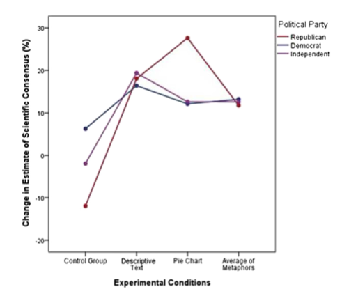
The authors do not speculate on why Republicans, and Republicans alone, seem to respond more strongly to pie charts. However, their bottom line conclusion is this: “presenting information in a way that is short, simple and easy to comprehend and remember seems to offer the highest probability of success for all audiences examined.”
This study probably won’t end the debate over whether telling people that “97 percent of climate scientists” agree on climate change is the best way to save this rock. But it certainly validates something that writers, bloggers, and media outlets have long known: You keep it simple, and you show pretty pictures.