Yu Ruidong/China News Service/VCG via Getty Images
This story was originally published by Wired and is shared here as part of the Climate Desk collaboration.
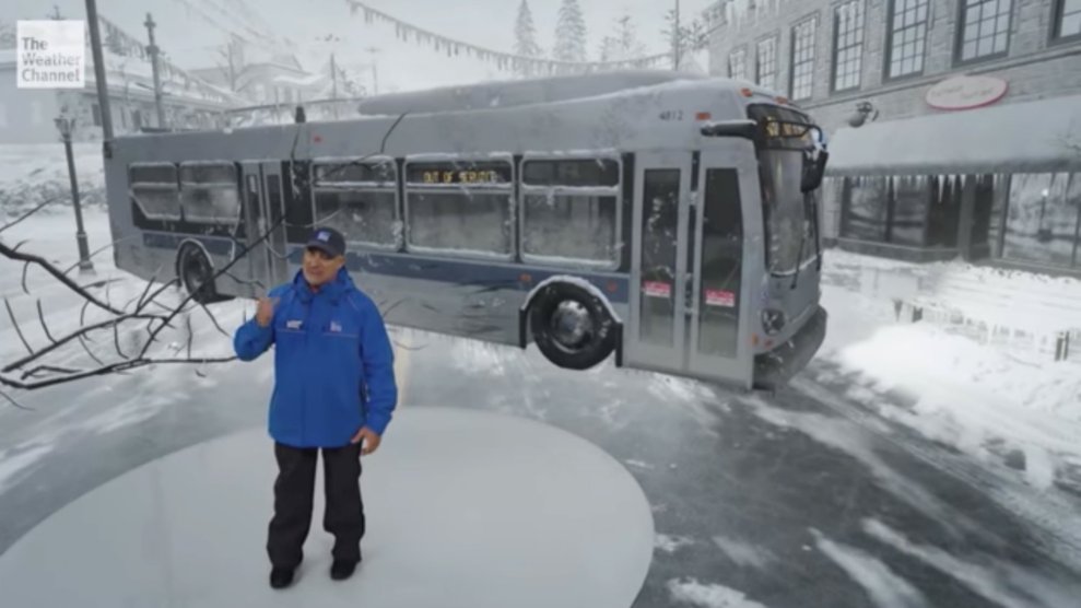
Not enough people care enough about climate change. It’s too remote, too removed from everyday life. Even those who acknowledge its enormity often don’t see what it has to do with them personally. So maybe this will finally break through: The Weather Channel’s immersive climate change experience, which puts you deep inside an inexorably changed world.
The latest in a series of roughly two-minute mixed-reality segments that place meteorologists inside extreme weather events—you may remember this gripping look at storm surges from last fall—debuted Tuesday morning. While climate change peppers the channel’s regular coverage, this is its most directly direct examination yet of its potential impact. And by far its most tangible.
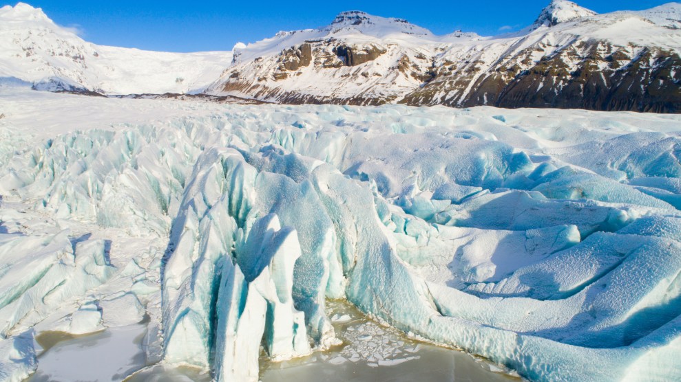
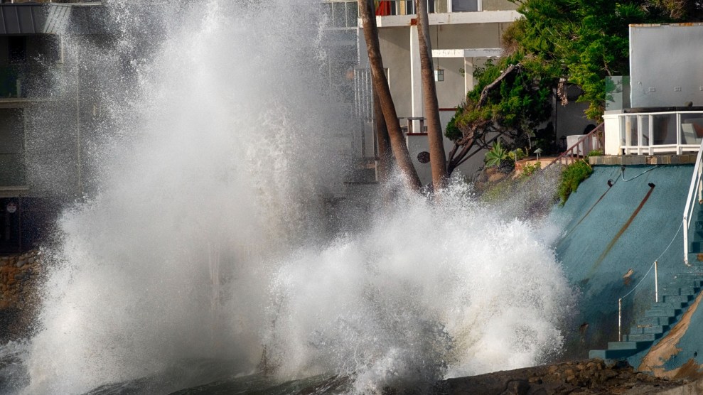
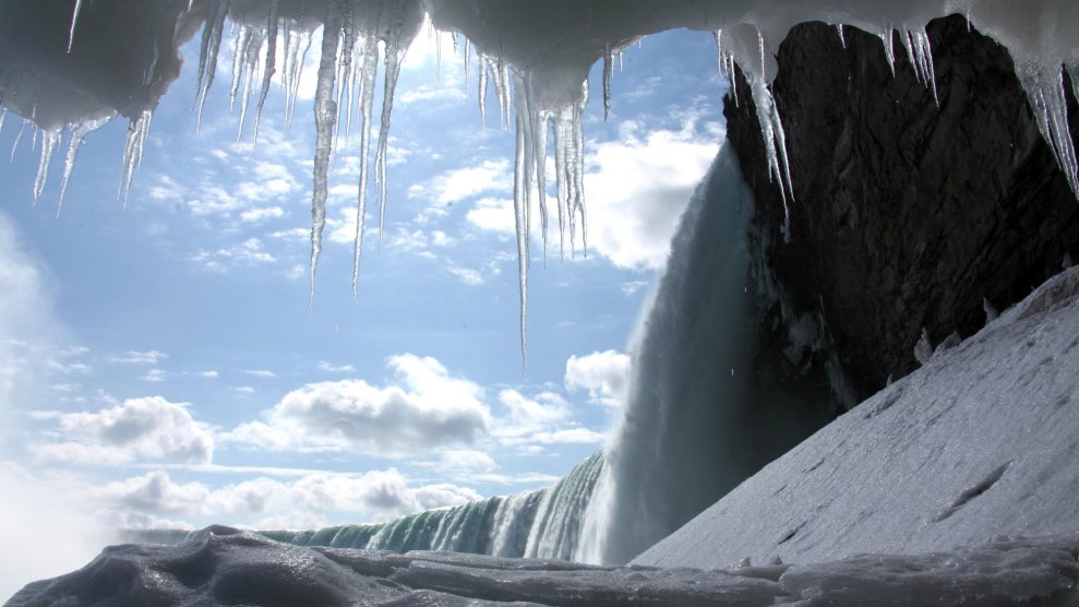
The report starts by placing meteorologist Jen Carfagno in the year 2100, where rising sea levels have left the city of Charleston, South Carolina, broadly, perpetually flooded. It then cuts to present-day Norfolk, Virginia, home to the largest naval base in the US, where that same crisis plays out on a near-annual basis. Finally, it hurtles back to 1851, showing just how much ice the famed Jakobshavn glacier has shedover nearly two centuries.
Together, the three portions present a look not just at the future of climate change, but its present and past, a three-pronged effort to shake viewers out of their malaise.
“We’re always trying to figure out a way to tell climate change in a way that resonates with people, and it’s extremely difficult,” says Nick Weinmiller, Weather Channel creative art director. “People tend to ignore things that aren’t happening right now, where they can’t quantify how it’s affecting them. We’re constantly trying to find that story for climate change that can get people to understand what’s going on and to listen to the science.”
The Weather Channel team stuck strictly to verifiable data for its glimpses of the present and past; the Norfolk segment draws directly from National Oceanic and Atmospheric Administration tide gauges, while Jakobshavn’s recession has been meticulously documented over the decades. The message is simple but effective: You can’t punt on climate change.
“You don’t have to show these worst-case scenarios all the time,” says Weather Channel executive weather producer Matt Sitkowski. “When we’re in Norfolk, the water’s not waist-high on our talent. It’s showing that there’s water covering the streets and the roads. It’s not that deep, but this is it. This is happening now. It’s the canary in the coal mine, a warning sign for the future.”
When it came to depicting the future of climate change, the Weather Channel chose to focus on the year 2100. The 81-year jump is close enough that some children alive today will still be around to see it, and climate scientists often use 2100 as a convenient end point for projections. As for location, the team opted to show the effects on Charleston, rather than a more obvious target like Miami, for a stab at a fresh perspective.
Even narrowing down to Charleston 2100, though, left the Weather Channel with plenty of latitude for its presentation. Climate change projections have ranges, after all, from the most optimistic outcomes to broad devastation. Sitkowski says that while they sourced their sea level estimates from NOAA and the United Nations’ Intergovernmental Panel on Climate Change, they again opted for a “higher-end scenario” rather than the worst case.
“It’s really hard to figure out how to make impactful scenes from climate change without going to extreme, end-of-the-world type of scenarios, where you see all this terrible stuff that could happen,” says Weinmiller. “I think people might call baloney on that kind of thing and dismiss it.”
While visually compelling, the segment points to no specific causes of climate change, mentioning only that “warnings were ignored.” And it offers no prescriptions for fixing it. The Weather Channel is understandably limited by the constraints of a roughly 90-second television piece, but its relatively narrow view of the problem may limit its effectiveness.
“Information has some positives but is not, alone, helpful,” says Janet Swim, a psychologist at Penn State University who focuses on how people respond to social and environmental problems. Swim has not seen the Weather Channel’s presentation, but in an email to Wired she stresses the importance of realistic, digestible information about the science behind climate change, and what businesses and communities are already doing to combat it. To turn communication into action, you need to make it personal. “If there is not an emotional connection to the place harmed, it can confirm that the problem is for others, not them, to worry about,” writes Swim.
That, in part, is why one recently published, highly detailed map of how climate change will affect 540 North American cities went viral. No matter where you live in the US, it can show you what’s in store: Washington, DC, for instance, will feel more like East Texas by 2080; San Francisco is headed for Los Angeles conditions.
“The reason we got a lot of attention was partly timing; there seems to be a lot more climate change in the news,” says Matt Fitzpatrick, an ecologist at the University of Maryland Center for Environmental Science and lead author of the paper behind the map. “And also because we did a very large number of cities, and a very large number of scenarios.”
What the Weather Channel’s simulation lacks in breadth, it makes up for with flair. And that might count for something.
“We’ve seen an increase in extreme events and things like that, but most of the changes are relatively gradual. There’s kind of a new normal all the time. People slowly adjust to it and don’t realize how much things have changed since they were younger,” says Fitzpatrick. Research bears this out as well. “I think we just need people to grasp the magnitude of the problem.”
As with previous immersive experiences, the climate change segment takes advantage of Unreal Engine, a suite of tools made by Fortnite creator Epic. The team films in a specially outfitted studio with a Mo-Sys camera tracking system, which allows a camera to operate in a virtual space. And whereas the Weather Channel created its viral “storm surge” video with the help of the Future Group, a mixed-reality studio, it has since brought those creative duties in-house, a move that Weinmiller says helps them adjust better on the fly.
Given the cadence of one immersive segment a month, that adaptability comes in handy. The Weather Channel was working on finishing its climate change video late into the night Monday; the water simulations have proven difficult. “They’re missing shading and shadowing, so they don’t have a lot of depth to them right now,” says Weinmiller. “They come out very white and bright, because the shading was an extra complexity that the engine couldn’t handle without glitching and performance issues.”
That extra dose of realism matters more than you might think. Knowing intellectually that Charleston will be underwater is a far cry from seeing it. Maybe closing that gap is the difference between awareness and action. “Anything that can help people imagine what the future will look like—which is otherwise invisible—can be a very powerful communication tool,” says Anthony Leiserowitz, director of the Yale Program on Climate Change Communication. “It depends on the actual visualization though, how realistic and convincing it is.”
Will richer detail of the splash an iceberg chunk makes when it falls into the water jolt viewers out of complacency? Will Norfolk as it really is carry as much weight as what Charleston will become? At this point, we’re already barreling toward climate hell. Anything that helps is worth a shot.
Watch “The Science Behind Vanishing Ice” here: