
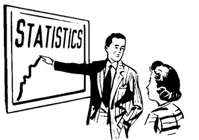
Seth Michaels wants me to republish an old post setting out the top ten mistakes that infest day-to-day reporting of numerical and statistical information. Well, why not? Let’s call them statistical zombies so that I can get in on the zombie craze. Here they are:
- What’s the real income? Money comparisons over time should almost always be reported in real inflation-adjusted terms or else they’re worthless. In nearly all cases, they should be reported in per capita terms as well.
-
What’s the survey error? Statistical sampling error in opinion polls is trivial compared to the error from other sources. Things such as question wording, question order, interviewer bias, and non-response rates, not to mention Bayesian reasons for suspecting that even the standard mathematical confidence interval is misleading, give most polls an accuracy of probably no more than ±15%. Example: a couple of years ago a poll asked respondents if they had voted in the last election. 72% said yes, even though the reality was that voter turnout in that election had been only 51%. Most polls and studies are
 careful to document the statistical sampling error, but who cares about a 3% sampling error when there might be 21 points of error from other causes?
 - Does A really cause B or might there be another explanation? If A and B are correlated, A might indeed cause B, but it’s also possible that it’s just a coincidence or — even more likely — that some third source is causing both A and B. This problem is especially rampant in social science studies where virtually everything is related to everything else and even well designed multivariate analysis is extremely difficult.
- Is it the first study? Even putting aside other errors, 95% confidence means there’s a 5% chance that the result is wrong. We only believe that smoking causes cancer because there have been hundreds of confirming studies. Always be cautious about accepting the first study on any subject.
- Maybe it really was just a freak chance. “That can’t be a coincidence” is usually the result of not understanding how many rare things are nonetheless likely to happen once or twice in a population of 300 million. In a large country, there will always be some cities, or some groups, or some people, that are way above average for, say, cancer. The flip side of this is that something that seems dangerous might not really be. 100 kidnappings a year might seem like a lot, but in reality those are odds of one in three million. That’s less likely than the odds of two people randomly picking out the same word from an encyclopedia.
- Compared to what? A 5% rise might be good or might be bad depending on whether everything else is growing at 0% or 10%. Which is it?
- Is there contradictory data? Two types of publication bias are involved here: researchers often don’t publish null results, and newspapers don’t bother reporting them when they are published.
- Statistically speaking, why did the headline number go up (or down)? Did everyone’s income go up 5%, or was it just that Bill Gates’ income went up 1000%? Distribution is as important as central tendencies. Check for mean vs. median. The value of statistics is to summarize a large mass of data, but it’s important not to summarize too much.
- Was the sample large and unbiased? For example, the original gay gene study used only about 40 people, and that was simply all the data they had. What’s worse, even if you do have a large sample it’s still difficult to ensure that it’s unbiased. Chapter 29 of Dana Milbank’s book Smashmouth is a pretty good down-and-dirty introduction to the delicate and tricky decisions that election pollsters have to make under deadline pressure to try and get accurate results.
- Does all the data point a little too cleanly to a single cause? Life is messy. A single report can often produce masses of data and should probably be viewed with suspicion if it claims that every bit of its data can be explained by a single cause — especially if it’s a cause that the researcher is already known to favor.
Plus I’ll add another pet peeve that’s numerical but not strictly statistical in nature: the reluctance to simply report percentages as percentages. This leads to sentences like this: “Although 40% of voters support spending reductions, nearly a third don’t want defense spending cut and two in ten decline to identify any reductions at all.” This is almost unreadable. Why not just provide the percentages in parallel form? I really don’t think readers are so stupid that they can’t handle it.
And via Seth, here’s another approach to identifying bad everyday statistics, but with examples! Take a look and see if you can spot the errors.