
Fight disinformation: Sign up for the free Mother Jones Daily newsletter and follow the news that matters.
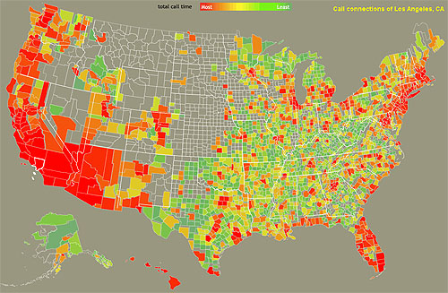
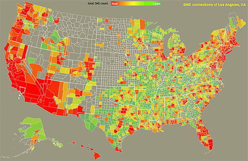
Via Andrew Sullivan, Alex Goldmark directs us to the the MIT Senseable City Lab’s Connected States of America mapping project, which sports an interactive map showing who we talk and text to. The map wouldn’t show Orange County for some reason, so I tried Los Angeles instead. Two things immediately jumped out at me:
- Connection volume seems to be a pretty simple combination of geography (we know more people near us) and population density (we know more people in big cities because big cities just have more people).
- The maps are surprisingly similar for both call and text volume. Should I have expected them to be different? Maybe not, but I did.
Of course, there are also a few weirdnesses. Why so many calls and texts to Codington County, South Dakota, and Tulsa, Oklahoma? Big call centers? What about Fayette, Tennessee?