
With income inequality on everyone’s radar today, the Center on Budget and Policy Priorities tweets this:

Quite so. This gives me an excuse to repost one of my favorite tables. It compares how much income various groups make today vs. how much they would be making if everyone’s incomes, rich and poor alike, had grown at similar rates since 1979. As you can see, by 2005 the bottom 80% were collectively earning about $743 billion less per year while the top 1% were earning about $673 billion more. It’s sort of uncanny how close those numbers are. For all practical purposes, every year about $700 billion in income is being sucked directly out of the hands of the poor and the middle class and shoveled into the hands of the rich.
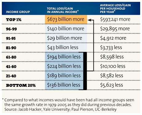
One of the points this drives home is just how much the story of growing income inequality really is a story of the top 1%. Inequality has increased within the bottom 99%, but not all that dramatically. It’s really the top 1% and the top 0.1% where all the action is. So if the Occupy Wall Street folks are ever looking for an alternate slogan, they might consider “Give us back our $700 billion.”
You can, of course, try to concoct some story in which growing income inequality has boosted economic growth, so that the gains of the rich have been solely from income that nobody would have gotten otherwise. But it’s a pretty tough story to tell, because there’s simply no evidence for it. The American economy hasn’t been growing any faster over the past 30 years than it did in the 30 years before, it’s just distributed the gains of its growth disproportionately to the rich.
To bring this home a little more vividly, take a look at the row labeled “41-60.” That’s the dead middle of the income distribution. If all income groups had grown at the same rate over the past 30 years, that median household would today be making about $10,000 more than they are. That’s the price we pay for our growing plutocracy.
Want more charts? This one comes from the chart pack we did for my article earlier this year, “Plutocracy Now.” Click the link if you want to read it, or else click here if you just want to browse the charts.