The Kaiser Family Foundation retweeted an old chart about health care expenditures yesterday, so let’s do one of our own:
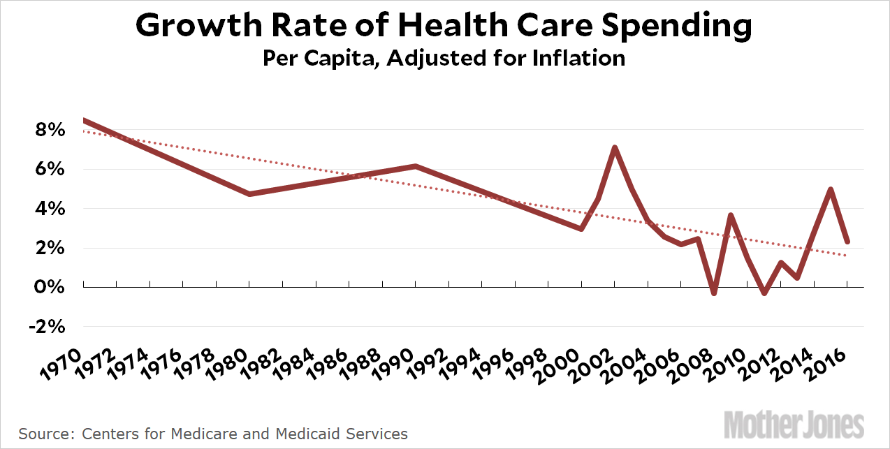
The growth rate is slowing down (yay!), but the decadal data from 1970-2000 hides a big bubble in the 70s and 80s. For a longer-term view, here’s plain old medical inflation as calculated by the BLS. This chart shows how much higher medical inflation is compared to general inflation:
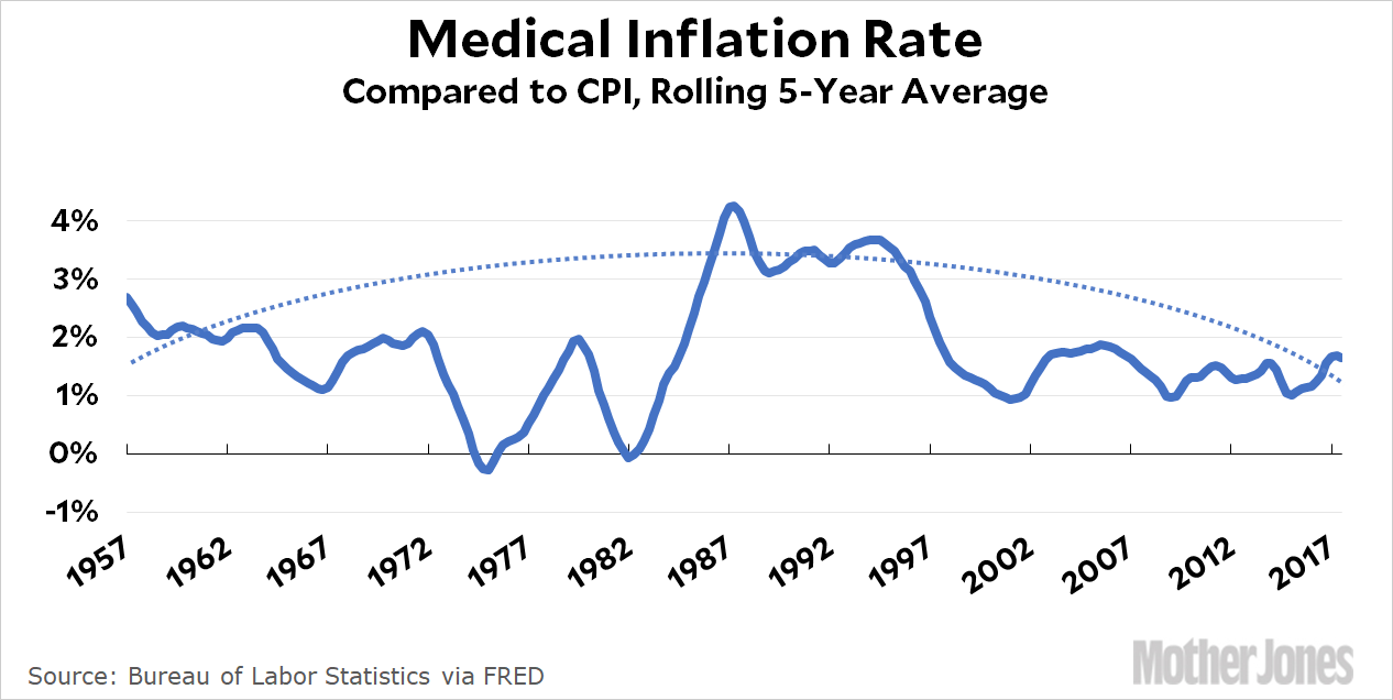
Massive increases in health care spending are neither normal nor inevitable. Until the late 70s, medical inflation ran at about 1-2 percent above overall inflation. Then, for nearly two decades, we suddenly went nuts and allowed every player in the health care industry—doctors, hospitals, drug companies, device manufacturers—to go on a wild spree of increasing their prices as much as they felt like. Being a physician changed from being a comfortable, upper-middle-class occupation to being a member of the top 2 percent. Hospital CEOs got rich. Pharmaceutical companies introduced rafts of new medications and discovered they could charge whatever they wanted and no one would stop them.
Finally, in the late 90s, the party ended. We all woke up to discover that an entire sector of the economy had grabbed an extra trillion dollars for itself for no particular reason except that they could get away with it. So we finally got serious about reining in health care costs, and we did. Medical inflation went back to 1-2 percent above overall inflation in the early aughts, and lately it’s been even lower than that.
Unfortunately, the crazy years pushed prices permanently higher. So year in and year out, the health care industry still gets their extra trillion dollars. We’ll probably never claw that back. But at least it’s not getting any bigger these days.


