
I was noodling away this morning and came across a Bob Somerby post responding to a New York Times column that was fact-checking Donald Trump’s claim that the budget he signed on Friday provided the military with “the largest pay increase for our incredible people in over a decade.” As it turns out, it’s actually the largest in the last eight years, not the largest in over a decade. Somerby thinks it should therefore have been labeled “wrong,” “incorrect” or “false,” not “imprecise and requires more context.”
Fine. But the real reason I’m writing this post is because I was eventually led to a report from the Congressional Research Service that lays out how military pay increases work. It turns out that pay increases are based on a formula that’s similar to the inflation rate. Congress and the president are involved only if they want to change the formula. Here’s what this looks like since the current formula was put in place:
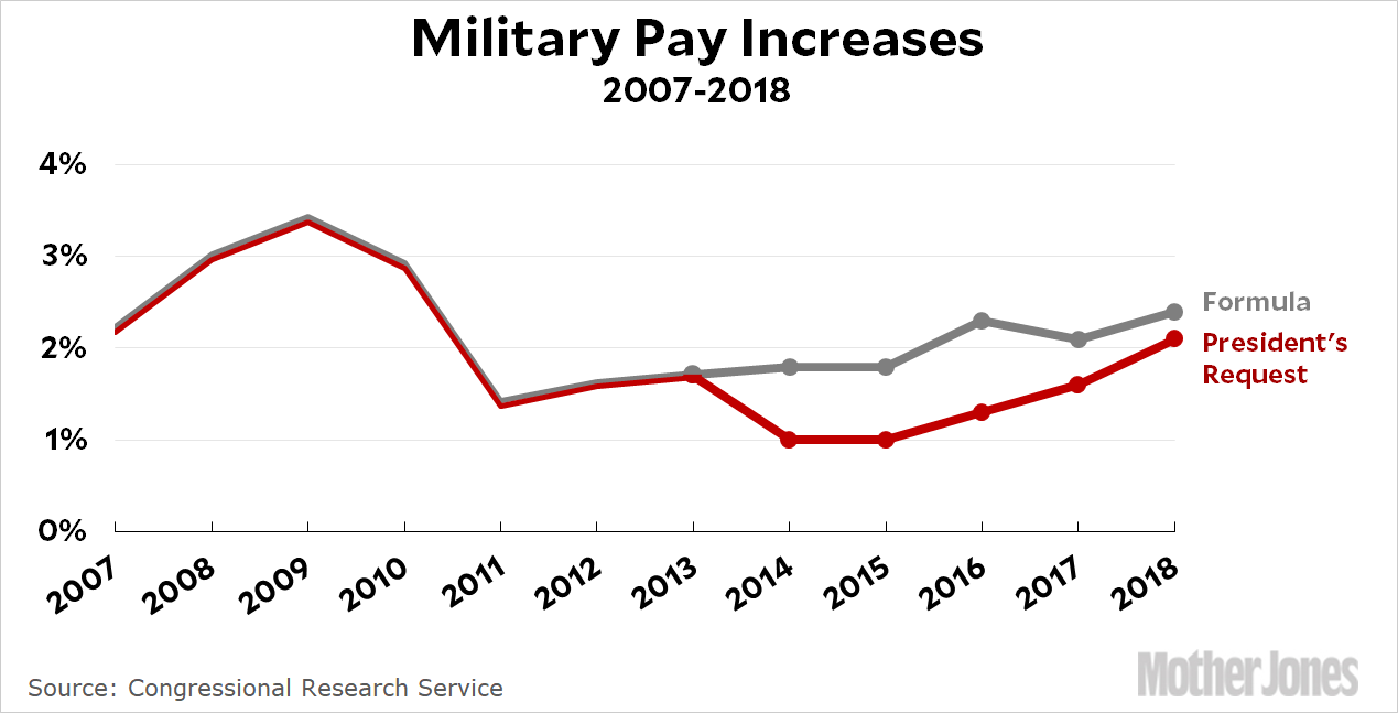
The Pentagon has lately been trying to reduce the growth of compensation costs following a decade of substantial increases, so they’ve requested pay raises lower than the formula for the past five years. This year, President Trump went along with that. He did nothing to try to increase pay for the troops. In the end, though, the military got a raise this year that matched the formula, which came to 2.4 percent. This is thanks to Congress, not President Trump.
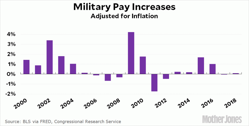
But that’s nowhere near the most important point. Whether a pay increase is large or not depends on the inflation rate. A 10 percent pay increase in 1980 would have been terrible. A 3 percent pay increase in 2009 would have been pretty good. Here’s the growth in military pay since 2000, adjusted for inflation:
In the only terms that actually matter to real people, this year’s pay increase is the largest since…2016. It’s the fourth-lowest of the past decade.¹ It’s nothing to write home about.
Now, I don’t seriously expect politicians to refrain from using whichever statistics make them look the best. That’s life. But for the rest of us, why can’t we simply agree to always use inflation-adjusted figures in cases like this and dispense with all the “context” and “imprecision” crap? With only very narrow exceptions, a series of dollar figures over time should be displayed primarily in real terms and news consumers should become accustomed to this. If you feel the need to show actual nominal figures as well, do it in a footnote or something. If you don’t know how to convert nominal to real dollars, then you should learn before you write about stuff like this. It only takes two or three minutes for someone to show you how.
¹Based on a consensus inflation forecast of 2.3 percent for 2018.