NOTE: Please see here for a critical update, including solid data going back to the start of the 20th century. It turns out that millennial homeownership these days really is substantially lower than it was on average during the pre-bubble era.
Yesterday I posted a chart showing homeownership among households headed by those under 35. It caused a stir on Twitter. Gray Kimbrough, an economist in Silver Spring, called it “bullshit” and “garbage,” I responded in turn, and things went downhill from there. I tried to sue for peace later on, but was unsuccessful.
So let’s take another look at the data. First off, it turns out the Census Bureau provides an EZ spreadsheet of homeownership going back to 1982. I didn’t realize this because the spreadsheet is titled “Annual Estimates of the Housing Inventory by Age of Householder 1982 Present.” However, it turns out that it actually provides homeownership rates, and with that in hand I can provide a chart with more years of data than I did yesterday:
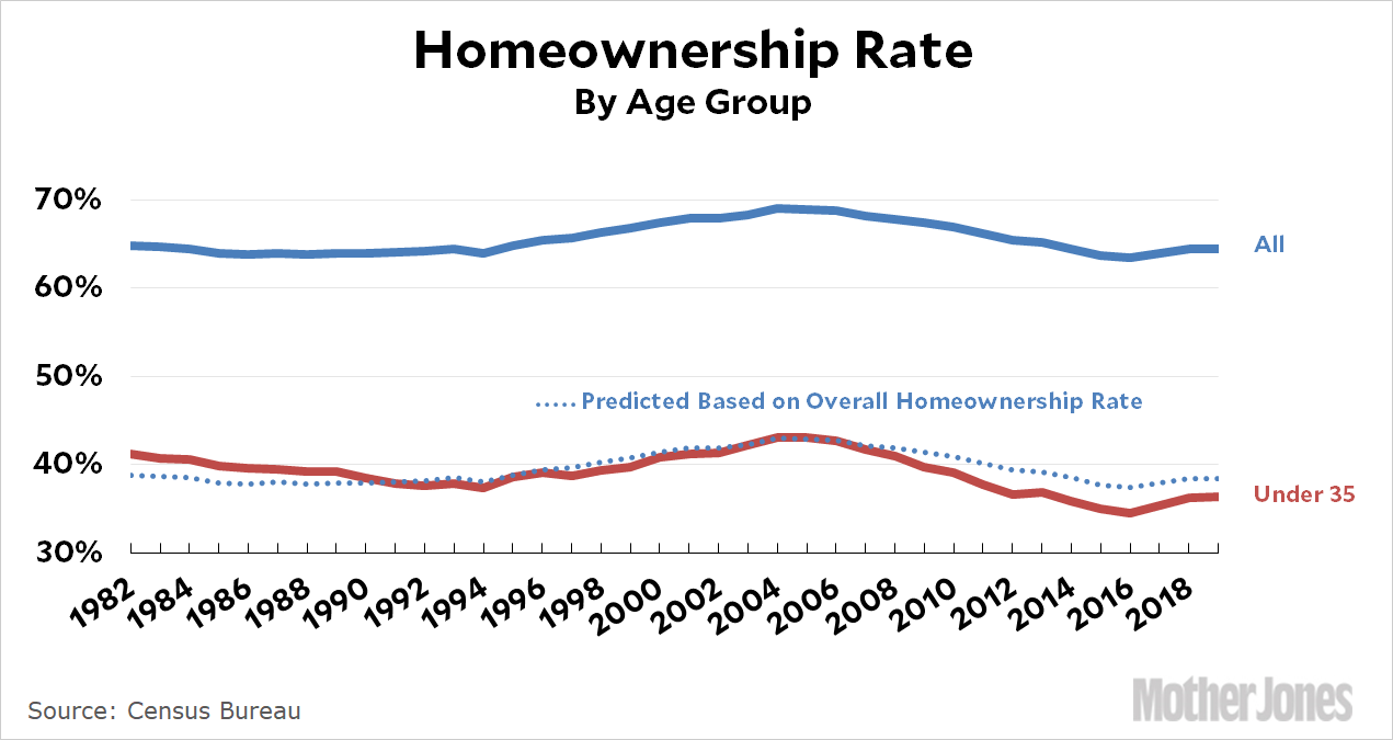
The heavy blue and red lines are actual data from the Census Bureau based on household data. For example, in 2019, 36 percent of households with a “reference person” under age 35 owned homes. The dotted line is simpler than the one I used yesterday: all I did was move the blue line down to see how closely it matches the red line. That’s it. As you can see, it fits fairly well.
Next up is another few years of data from Kimbrough. This takes us back to 1976:

I’m not sure what to make of this. There’s a sudden spike in 1979 that’s far bigger than the modest rise in the overall data. What’s more, where the data overlaps in 1982, Kimbrough shows a homeownership rate about three points higher than the census spreadsheet. Maybe this is individual data, not household data? But after 1982 it goes back to matching just fine. So what’s up?
I’m not sure, but Kimbrough also provides the following data:

This is individual data, and shows the share of each group living in an owned home. That’s different from ownership data, but it does confirm one thing: age groups seem to move in pretty close sync, which has been my hypothesis. The mystery here is that we have firm data for the overall homeownership rate, and it doesn’t spike in 1979 even though Kimbrough’s chart suggests that every single age group did. We’re left with a riddle here, but it’s one I can’t solve at the moment. Perhaps Kimbrough will weigh in later.
In any case, using the same methodology as yesterday, here’s a projection back to 1964:

Is this bullshit? Maybe. It wouldn’t be the first time. But even if we take Kimbrough’s spike at face value, there’s still every reason to believe that homeownership in the under-35 cohort syncs up fairly well with other age groups. If that’s the case, the homeownership rate among young households has gone from roughly 37 percent in 1964 to 36 percent in 2019. There have been peaks and valleys in between during housing bubbles and interest rate catastrophes, but there’s little reason to think that the long-term trendline has changed a lot. (On the other hand, if you take my dotted blue line seriously—and I’m not demanding that you do—it shows that homeownership among young households is a couple of points lower than we’d expect. This suggests that millennials haven’t yet recovered fully from the housing bust.)
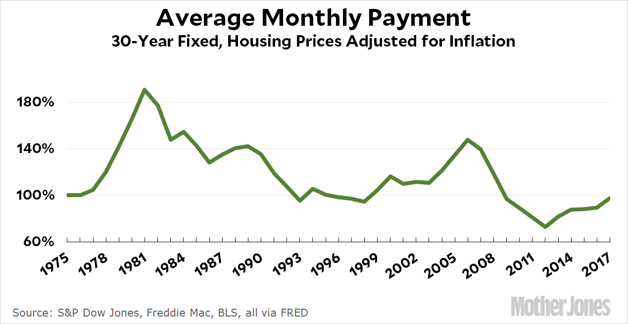
In one sense, the flatness of homeownership shouldn’t be a surprise. After all, the average monthly cost of buying an average house hasn’t changed much over the past few decades:
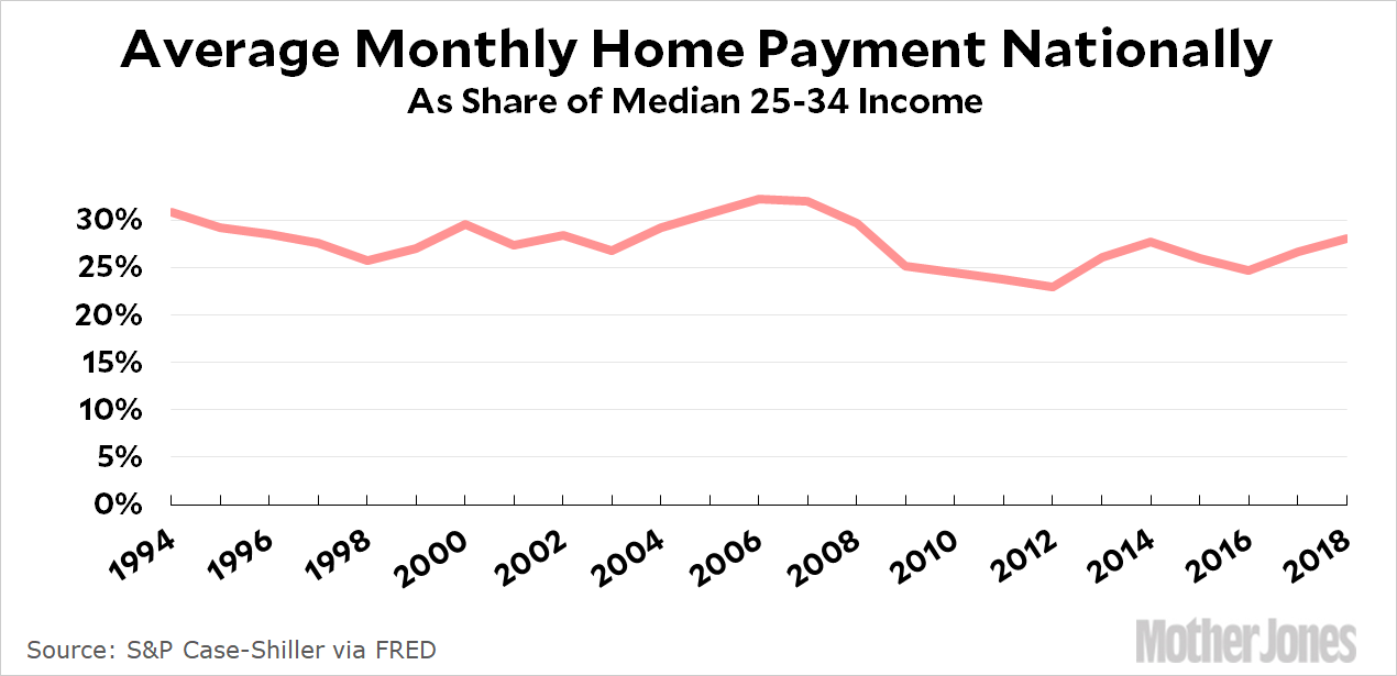
But wait! We’re not done yet. Beyond all this there’s a technical question of whether we should be looking at households or individuals. I’m using households because that’s the way homeownership is usually reported. But the Great Recession put a big dent in the rate of household formation among the young. This means that if you count individuals, the rate of homeownership has gone down more than if you count households. Here’s the growth and decline of homeownership for the 25-34 age group using 1994 as a base year:

Compared to 1994, the homeownership rate among young households is down a modest amount. But if you look at all individuals, it’s down by twice as much. I think these are both useful ways of looking at things, and I’m not sure you can say that either one is “right.” A lot of it depends on why household formation has fallen off (is it low incomes or changing preferences?).
With all this out of the way, my tentative conclusion is that homeownership among young households is probably down by 1-3 percentage points since the ’60s. It’s a real decrease, but not an enormous one. If I’m wrong, that’s fine. But we don’t have age-group data going back to 1964, so there’s nothing much we can do except extrapolate if we want to look at things over the long term.


