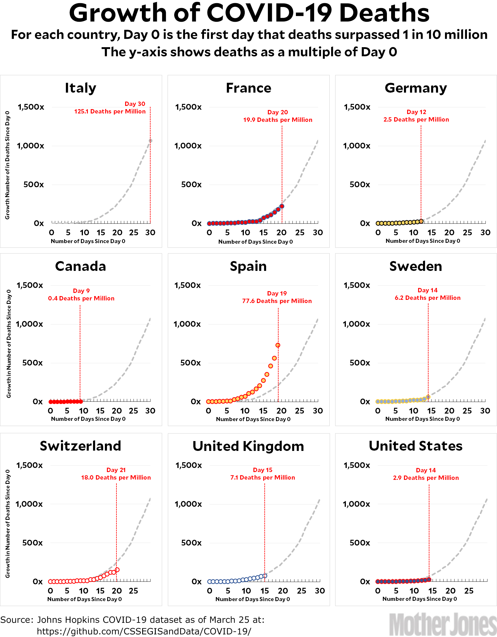
Here’s the coronavirus growth rate through Wednesday. I’ve corrected a small error in the Swedish chart, but there are otherwise no big changes to note. As usual, Switzerland and the United States are doing better than the Italian trendline while Spain is doing a lot worse. Everyone else is pretty close to the Italian path.
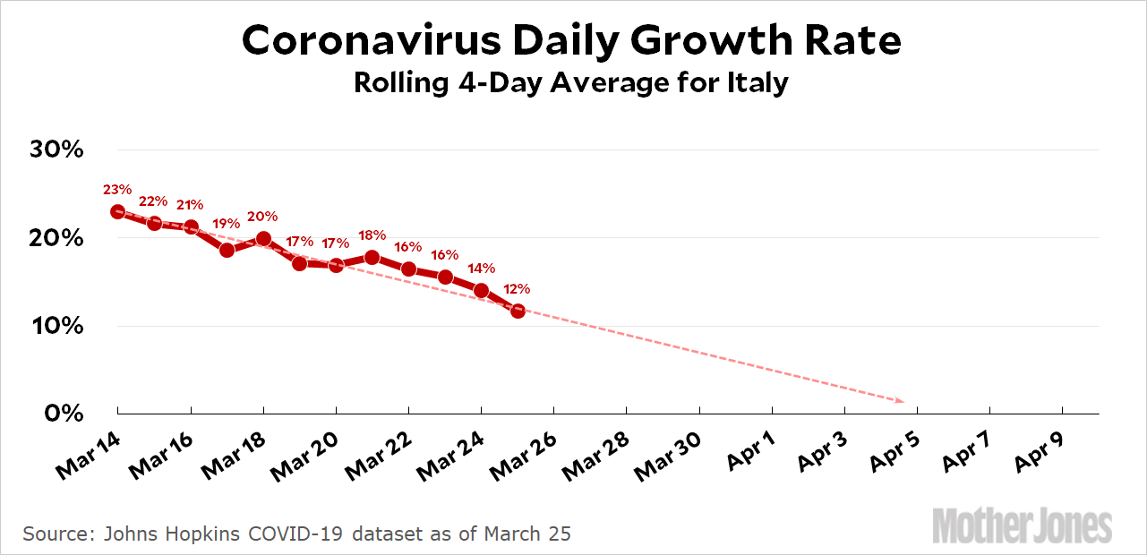
The Italian death rate continues to decelerate. Here’s another look:

This is a simple four-day rolling average of the day-to-day growth, and it suggests that growth will go to zero in the four-day period from April 3-6. If this holds up, growth will then turn negative until the death toll reaches zero in early May. This shows the same thing as my previous charts, in which I roughly fit a normal curve to the Italian death toll.
Here’s how to read the charts: Let’s use France as an example. For them, Day 0 was March 5, when they surpassed one death per 10 million by recording their sixth death. They are currently at Day 20; total deaths are at 222x their initial level; and they have recorded a total of 19.9 deaths per million so far. As the chart shows, this is slightly below where Italy was on their Day 20.
The raw data from Johns Hopkins is here.


