
On Friday I posted a series of charts comparing the coronavirus breakout in six Western countries. Italy was the baseline, using the day they passed 100 confirmed cases as Day 0. All the other countries also used the day they passed 100 confirmed cases as Day 0. What it showed was that everyone was following the same trendline as Italy. They were just a few days behind. The only exception was the United States, which showed a substantial tick upward above Italy on the final day.
But the more I thought about this, the more I wondered if it was correct. The US could tick up only if there were lots of test kits available to confirm coronavirus cases, and we haven’t had a lot of test kits available. So I decided to replicate the charts myself. Here they are:
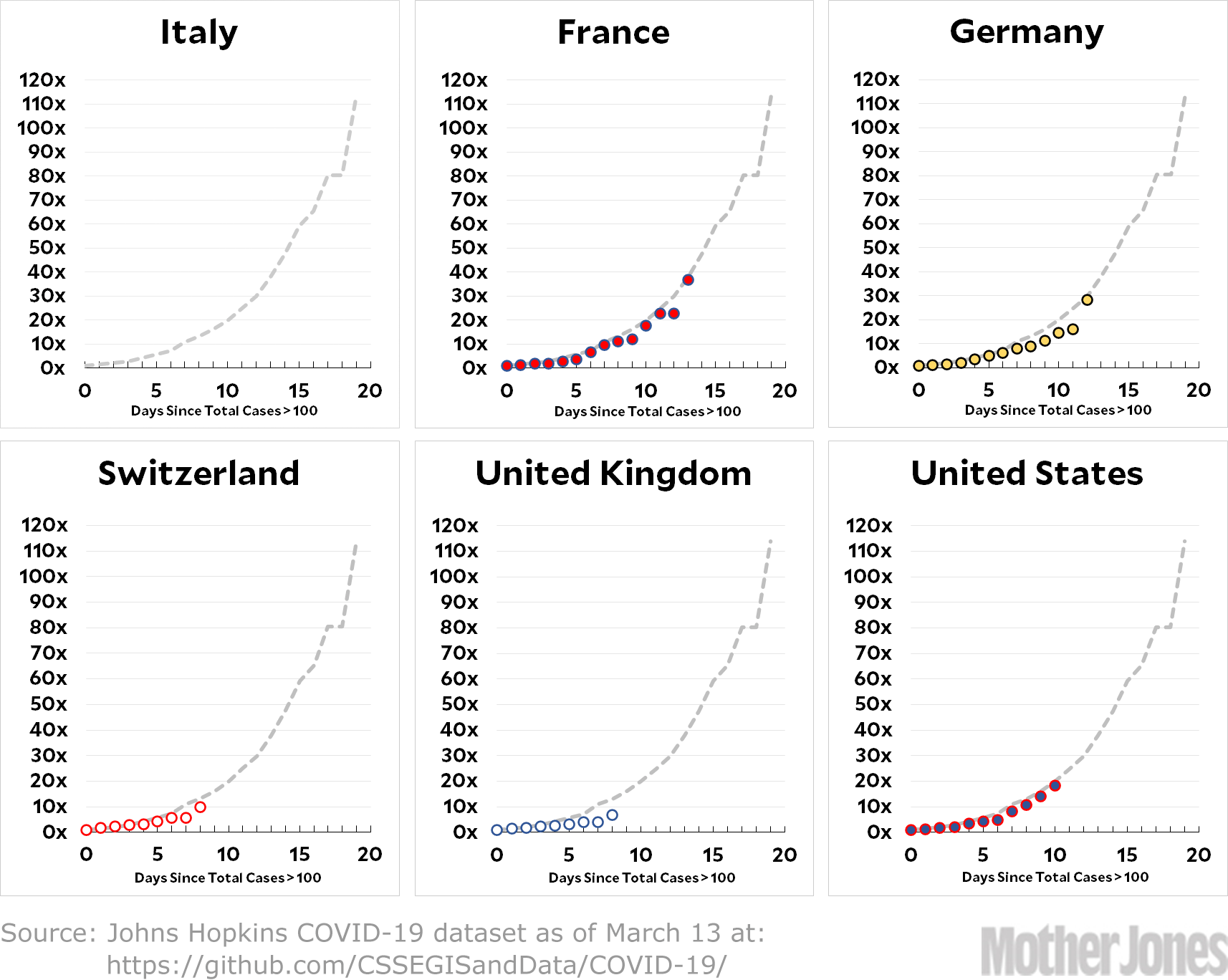
My charts go through March 13, rather than March 10, and the main takeaway doesn’t change much: every country is on Italy’s path. The United States does show an upward tick between March 9 and March 10, but it’s not enormous and it only puts us back on the main trendline anyway, not above it. The other countries also show a tick upward, including Italy, but it happens on March 13.
My tentative conclusion is that it was wrong to suggest that the United States had a big tick upward on March 10, and wrong to suggest that none of the other countries ever had a tick upward. As near as I can tell, every country is following nearly the exact same trendline regardless of how well or badly they responded to the outbreak.
METHODOLOGY: My charts are slightly different than the ones I showed you this morning. The spreadsheet with the daily data from Johns Hopkins is here. I summed up the numbers for each of the six countries normally, but I ditched the log scale on the y-axis. Instead, I normalized Day 0 for every country to 1 and then showed the growth rate instead of the raw numbers. I think this makes things a little easier to understand, and the raw numbers are easily available if you click the link and copy the spreadsheet yourself.
It is, as always, possible that I’ve made a mistake. If you think you’ve found one, please let me know.
UPDATE: Apparently the Johns Hopkins dataset contained an error that was corrected midweek. By chance, I was using the corrected numbers, which is why I didn’t replicate the spike. The other set of charts is also using the corrected data now, and everyone’s charts are happily in agreement.