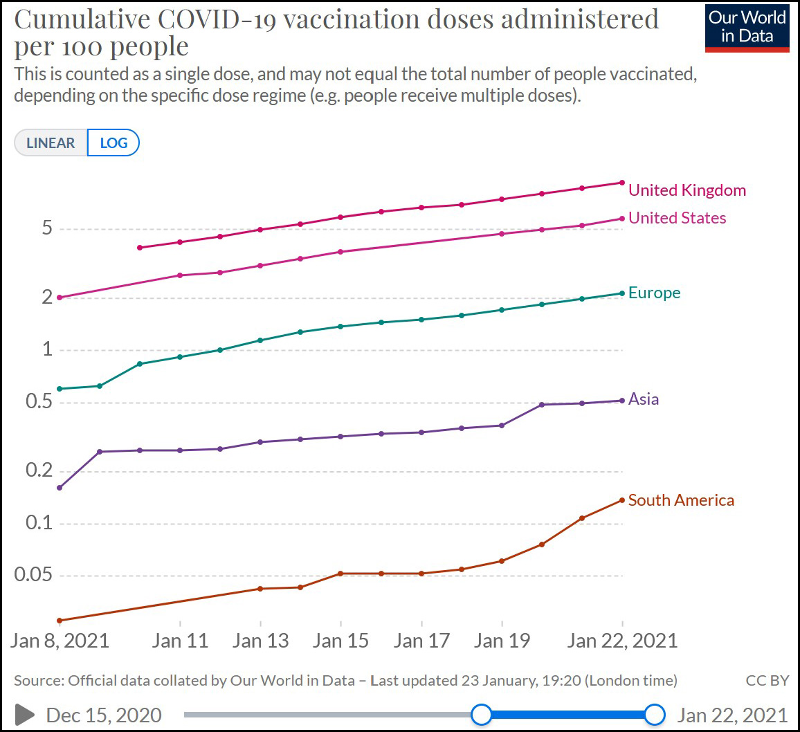
I’ve posted before about vaccination rates in the US and Europe, but here’s the same thing charted in a somewhat different way:

This is a log chart, which means that a straight line indicates exponential growth. As long as the line for the US remains straight, it means that every day we’re vaccinating more people than we did the day before. Right now, our cumulative total (as a percent of population) is about a week behind Britain, while Europe is about two weeks behind us. All three, however, are so far on similar straight line paths, which means everyone is vaccinating more people every day.
This won’t last forever, of course. At some point the system hits capacity and growth slows. Or, in this case, we will probably be slowed down by supplies of vaccine. Still, our growth rate is about the same as Britain and Europe and our absolute percentage is quite a bit higher than Europe. That’s not so bad for an enterprise that everyone warned beforehand was by far the most complex vaccination effort in history.


