Sure to be an off-the-charts success<a href="http://www.amazon.com/I-Love-Charts-The-Book/dp/140226738X">I Love Charts</a>
It’s tough to shake the impression that we’re living in a golden era of data visualization supersaturation. “Charts are to bloggers what autotune is to rappers,” tweeted Wired‘s Spencer Ackerman last December. Consider us guilty.
Which is why, when Jason Oberholtzer and Cody Westphal set about spinning their popular Tumblr, I Love Charts, into an eponymous book, they wanted to do more than rehash their favorite posts. I Love Charts is Tumblr at its simplest and most effective—a single-serving site devoted to, as you may have guessed, Venn diagrams, flowcharts, clever twists on otherwise boring charts, and the stories they tell. Emphasis on stories. “There’s…been a bit of an evolution of what people are doing with charts,” Oberholtzer says. “It’s become more of a live medium than it used to be.”
Oberholtzer and Westphal’s book, I Love Charts, hits stores on Tuesday. Mother Jones spoke with Oberholtzer, a 26-year-old New Yorker, about the rise of chart-based wonkery and the coming of Peak Chart.
Mother Jones: So your book is basically a memoir as told through charts.
Jason Oberholtzer: It was actually sort of a last-minute idea. We spent this summer basically operating under the premise that it was gonna be a coffee table book. The original deal we’d signed up for was take 300 charts, slap them in a binder, put them in Urban Outfitters, sell some paper. And I was never excited to do it, and that’s why we never finished. We called the editor and said basically, “We want to write something.” I wanted to offer people something that’s different than what they could get on the blog. I care about books, and I felt weird writing a book that I didn’t think needed to exist, and now I feel like it’s at least self-contained and it’s worth existing, for some reason.
MJ: A large percentage of the charts in the book hit on that theme—procrastination and not doing what you should be doing.
JO: That’s a large part of my creative process, for worse or for worse. But I gave it some time. I gave it two weeks before we started writing anything, just to whittle down all the charts we’d had and figure out which ones we wanted to keep. It sort of became apparent to me that the book was gonna be about itself, in some really dumb way. It’s nothing as corny as giving back, but almost to do it justice, sort of show people that these kids, people my age, people older than me, all sorts of people were trying to tell stories through these charts.
MJ: How many submissions do you get in a given week?
JO: Our inbox normally sits at about 1,000 charts. And we’ll burn through it and get rid of horrible ones and then in a couple weeks it’s back up to 1,000. They just keep coming in.
MJ: I get the sense that we’re in a chart surge.
JO: I would say that’s fair. I think—what was it, like mid-2009?—we sort of caught an upswing of that. But there’s also been a bit of an evolution of what people are doing with charts. It’s become more of a live medium than it used to be. It used to be, at least as far as I can tell, more about grandiose data statements and visualizations for visualization’s sake. [Now] it’s a lot more topical, and it’s a language.
Everyone’s so data literate these days, I don’t think that side of it is going anywhere. I think the side where people feel compelled to tell jokes with charts—that’s a novel thing. I can only see so many chart jokes.
MJ: Would we have this chart surge if there weren’t such a wealth of underemployed millennials with cats?
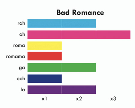
JO: That’s the origin story of the entire website. Cody and I were unemployed millennials who had personal Tumblrs. We kept lobbing back and forth charts when Lehman Brothers crashed, back and forth on one another’s Tumblr trying to one-up each other on how depressing we could find the world to be. I joked we should make a spin-off site. He made it the next day. I joked we should start populating it. About a week after that, Tumblr found out about it and promoted it on their Tumblr Tuesday segment and we had a thousand followers the next morning.
MJ: So how do you feel about Tufte?
JO: He’s really opinionated. I don’t know, the question is basically, “How do you feel about being an elitist stickler about a lot of things?” And so on some days, I’d rather not, and then on some days, I think it’s great.
MJ: What makes a chart a chart, as opposed to just a half-eaten pie?
JO: For my purposes, a chart is anything that I think I can defend as a chart that I want to put on my website. I tend to use the definition “a visual that is describing a narrative is a chart.” So I can just draw a picture with an arrow next to it, and I’ve decided it’s a chart.
MJ: Is there any kind of chart you don’t like? Pie charts are particularly divisive.
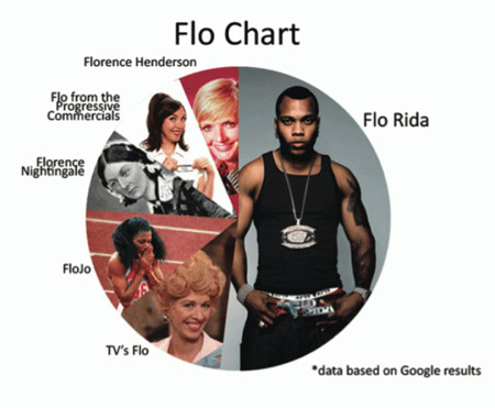 JO: Yeah, people dislike pie charts. I pretty much only use them when they’re in joke form. I hate infographics. If we’re talking about the story of the chart bubble, a lot of that has to do with infographics. I think people conflate the two and they should not. I think infographics are normally trash. They’re just words put on top of pictures, and quite often they’re done by like PR companies and ad agencies and SEO gurus and people just trying to spam you with dubious facts. I hate that, I think they’re worthless. No infographics.
MJ: Farhad Manjoo at Slate says there should be a Pulitzer for data viz.
JO: I read that! He was very unkind to political cartoonists. I agree with most of the stuff he said. There’s ways to use it that are incredibly helpful and shouldn’t be overlooked, and he was right to give you guys the nod on that.
MJ: Is chart literacy on the rise?
JO: Absolutely. A quick example is your x-/y-axis on independent variables; you used to get them in the wrong order. I used to just put them up because the jokes were good and, well, you know, it’s a joke chart and I’m not gonna whine about your x- and y-axis variables. After a while, I got tired of being lenient so I started complaining. In the past year I’ve only see like five that had been incorrectly done.
MJ: Could this kind of thing be possible without Tumblr?
JO: No way. It was just the perfect marriage of form and function and community. It came at a great time for Tumblr, when it still sort of had sort of a small-town feel to it. It’s big now and it’s great—I mean you can make books off of Tumblr now because it’s so big! There’s things you can do in a city you can’t do in a small town.
But it was really nice then to be able to sort of know every single follower. It bred this culture of submissions that has been the backbone of the site ever since; it was just a bunch of people coming up with chart jokes together and finding facts together. And I don’t know of another platform that would have let us operate like that.
MJ: Has that culture changed?
JO: It has a bit. It’s bigger and people talk less now. But it’s also that we’re bigger. I mean, people are gonna sort of talk less when they feel like we’re not their favorite indie band anymore; we’re a major label. We still talk to everybody who talks to us, and there’s still friends we chat with, but it’s got a little bit less of that feel. I guess our interests have changed so we leave less time for spending two whole days trading back and forth the dumbest joke we can make about dogs.
MJ: What led to that shift?
JO: For a long time I thought it was popular because people like charts, and I was the lucky monkey in the room full of typewriters that came up with the charts blog when it got big. So I sort of went on autopilot for a bit. And people started complaining—”Well, actually, our favorite part is your commentary; you’ve got a distinctive voice in there.” Which I never believed to be the case until I started trying to reassert it.
That sort of led me to include the things that I cared about more and to raise my own editorial standards. This isn’t just about silly charts; if I don’t think it’s funny or good or valid, I’m just not gonna put it up. And then Occupy came, which was just a font of great charts about issues that I cared about.
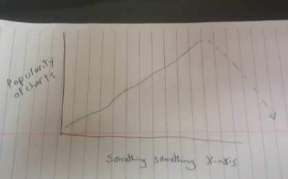 MJ: That seemed to be the first protest movement that was based on data viz.
JO: Absolutely. We sort of became known as a place that would talk about that. And we started having people complain that we were too much on the left. And I said well, I guess we have an editorial voice that someone can complain about.
MJ: Any worries that we’ve reached Peak Chart?
JO: I’ve been worried about that since, like, the day it hit. It’s why I put time into it to aggregate and curate things that usually have articles attached to them. I try to find a place that you can move on and do extra reading from. I don’t really care about charts that much! It’s more about the stories that people are able to share by them.
MJ: Do you have a favorite chart?
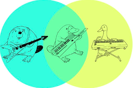
JO: We never repost a chart unless it’s an accident. Here’s a good one. I’m not sure if you call it a double entendre chart, but it literally has two meanings at the same time—the beaver with the guitar, duck with the keyboard, and then in middle is the platypus with the key-tar:
 MJ: That took a minute.
JO: Yeah, yeah. Because it’s the creature and the instrument.
All charts courtesy of I Love Charts


