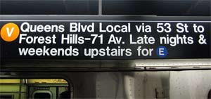
 Last year’s engaging documentary Helvetica made the point that the font’s use as the main typeface of the New York City subway is symbolic of its status as a singular “modern” design. Anyone who’s visited New York knows that the plain white-on-black lettering seems to bring a modicum of calming order to the tangled, chaotic system. Clearly this was all part of some benevolent modernist designer’s brilliant plan, right? Nope, it turns out it was kind of an accident. The Transportationist blog points out a fascinating recent article in the AIGA Journal of Design that shows just how haphazard the process really was.
The article looks back 100 years to the days when three separate railroad systems wound beneath the city, each with their own (mostly tiled) signage. It took until 1957 for them to start thinking about cleaning up the mess, when a typographer named George Salomon submitted a proposal called, amusingly, “Out of the Labyrinth.” His was the first design that proposed the now-familiar color-coded lines, but he also suggested Futura as the system font, a cold-feeling, mechanical-looking type. His plan wasn’t implemented, but helped point out the need for change. When London’s Heathrow terminal introduced what the article calls “the first coherent transportation sign system” in 1961, they used an early version of Helvetica, and then the floodgates opened, as transit systems and terminals worldwide jumped on the bandwagon.
Amazingly, when the New York City subway first implemented a standardized signage system in the ’60s, they were still hand-painting most of the signs, mostly due to “lack of money.” The first typeface used (as a guide for painters) was actually Standard, not Helvetica; you can tell the difference because Helvetica’s “c” and “s” have cleaner horizontal finishes, while Standard’s finish at an angle. Standard was the typeface throughout the ’70s, and Helvetica only took over with the MTA’s 1989 style manual, and for far more pedestrian reasons than a modernist design aesthetic:
By the end of the 1980s the full effects of the desktop publishing revolution—touched off in 1984 by the conjunction of the Apple Macintosh, Apple LaserWriter, Adobe PostScript page description language and Aldus PageMaker software—had begun to be felt in the graphic design community. … The only typeface that was available on all of these systems and methods was Helvetica.
So, like everything in our world, you can trace it back to Apple. It’s a long article but a fascinating one, and you’ll never look at the subway signs the same way again.
Photo used under a Creative Commons license from Flickr user bhermans.