With DC embroiled in budget battles and April 18 fast approaching, a lot of Americans are thinking about where their federal tax dollars go. Most of us have no clue, as shown by the recent CNN survey in which respodents guessed that NPR accounts for 5 percent of goverment spending (wrong—it’s more like 0.01 percent) and foreign aid gets 10 percent (try 0.6 percent).
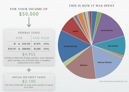
 Where Did My Tax Dollars Go?For an informative and visually interesting look at how your taxes really break down, check out the six finalists from the recent Data Viz Challenge sponsored by What We Pay For. The most creative is Budget Climb, an interactive game that uses a Microsoft Kinect motion controller so you run around a virtual world made of 26 years of budget data. If you don’t want to work up a sweat, a better place to start is Anil Kandangath’s Where Did My Tax Dollars Go?, a straightforward site that asks you for your income, estimates your income and payroll taxes, and then shows your personal contribution to the federal budget in an Excelerrific (functional but not pretty) pie chart.
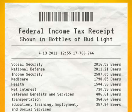
 Can I Get a Receipt With That?There’s also some clever stuff in the entries that didn’t make the final cut. My favorite may be Can I Get a Receipt With That?, which generates a cash-register receipt for your tax bill—and can convert the bill into alternative currencies such as Big Macs and Starbucks coffees. For example, the 2010 tax bill for a typical American family earning $50,000 comes out to about 1,752 Chipotle burritos. From that, the feds spent about 2,811 bottles of Bud Light on defense, 244 packs of cigarettes on Medicare, and 13 Red Bulls on energy spending. Unfortunately, it does not show how many decaf soy lattes went to NPR.


