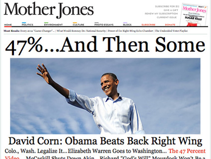
Even though by now I am 100 percent sure of who won the 2012 presidential election, looking at a traditional map of the results is unsettling. The red trumps blue, no matter how certain I am that more of the popular vote, and more electoral college seats, went to President Obama than his counterpart. See?
 M. E. J. Newman
So it’s somewhat of a relief to see these statistics represented differently. This cartogram below by Mark Newman, a physicist at the University of Michigan, scales each of the lower 48 states according to its population rather than its area.
 M. E. J. Newman
Though the map might make you question your cocktail intake, the increase in blue over red seems a more accurate depiction of how Tuesday went down.
Newman experiments with these type of cartograms here, modeling one map as related to the number of electoral college votes per state, and another based on a proportional representation of county size. You may have seen his work before: He’s been making cartograms for the last couple of presidential elections, ever since he helped create an advanced method for creating these “density-equalizing maps,” drawing from physics. His software is even free for anyone to download.
Newman also brings clarity to the data by introducing shades of purple to indicate percentage of votes in each county won by the Democratic or Republican candidate, and adjusting the counties for population size. Looking at this map is starting to feel a tad Fear and Loathing:
 M. E. J. Newman
If you’re getting into it, NPR also has this neat video that uses cartograms to depict outside spending on political ads, especially in swing states—in Nevada, these types of groups coughed up nearly $6 per potential voter between April and October, compared to less than a cent per voter in neighboring California.